As I have moved forward to produce a movement for World Peace, I have given some thought to our current peace sign. I did some research on it as I have wondered why it seems like it is inverted. I found out that British Artist Gerald Holtom designed it for the campaign for nuclear disarmament, CND. It was designed in 1958, and the CND was having its first major march in England.
Holtom explained that the symbol superimposed the semaphore letters N and D over each other. V reversed = N I = D. To quote Holtom, “I was in despair. Deep despair: with hands palms stretched outwards and downwards in the manner of Goya’s peasant before the firing squad. I formalized the drawing into a line and put a circle around it.”

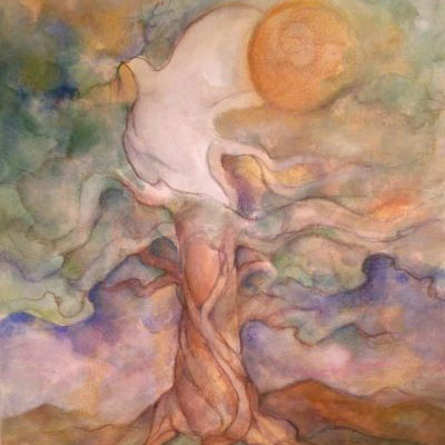
This does NOT fit into my idea of a Peace Symbol, which needs to be a symbol of Light! Symbols contain hidden truth; code that expresses in Light Language. This symbol of World Peace must be uplifting, joy-filled and powerful!
After collaborating with a lovely artist, Karen Haughey, this is the beautiful result! This is a sign that truly depicts Peace, World Peace.
Individuals and businesses alike will WANT to display this on their websites and in their businesses, but………… the privilege comes with eligibility and accountability.
Welcome to the World Peace Movement!
Happy Days are ours!!!
